Bend it like Von Donnersmarck: how to manipulate cameras and colours to make the vital truth truer and unforgettable
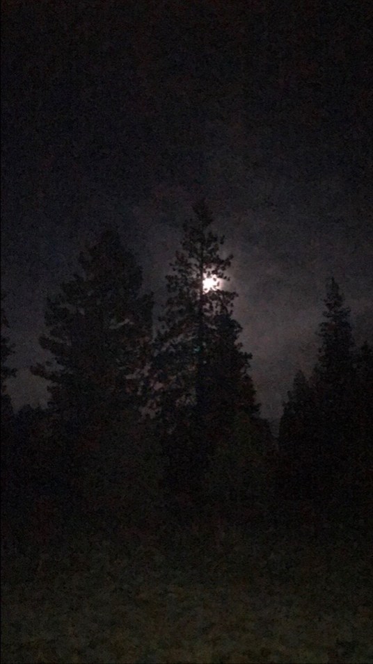
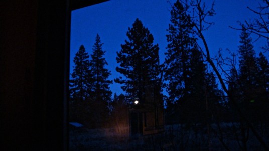
Supermoon, 1 January 2018: same scene, different cameras (above and below)
…
Of course cameras tell lies, even if ‘The camera cannot lie’ was so widely accepted as a truism, for decades, that it became an irritating cliché. The power of cameras as tools for sophisticated manipulations on the side of the angels, not devils, emerges from the most generous, revelatory interview with a film director that we have ever watched — a feature among the bonuses on the DVD version of Florian Henckel von Donnersmarck’s eleven year-old masterpiece, The Lives of Others (Das Leben der Anderen).
We remembered a section of that conversation titled Authenticity — about how von Donnersmarck used colour to engage and work on his audience subliminally — as we were studying startling divergences between pictures we took of the New Year’s Day supermoon, using two cameras whose factory settings we have never changed. Why, we wondered, did the baked-in choices (‘default parameters’) of one device yield the souped-up indigo sky of a Disney production, as in the image below, while the other — same view, different angle — gave us virtually what we had actually been looking at (above), no patch of any shade of blue discernible, and conveying what it felt like to be shooting nearly blind into darkness that was somehow both peaceful and faintly dangerous and, except in the pictures’ shimmering focus, dense and deeply inky?
In his account of making The Lives of Others, the director described his chief dilemma. How do you tell the truth about something horrible of the highest importance, giving your viewers a palpable sense of what it was like, but without repelling them, and holding their attention for two hours and seventeen minutes?
He explains how he decided that using a radically constricted colour scheme could help him to steer his tricky course between those objectives to tell his story about the transformation of an officer in the Stasi, the secret police of the former German Democratic Republic (GDR or East Germany), after this officer’s discovery — through his unintentional absorption of poetry and music — of his heart and conscience.
Von Donnersmarck, who was born in West Germany but travelled with his parents to the GDR as a child, felt that he had to immerse his audience in the claustrophobic atmosphere of this surveillance state whose citizens lived in fear of sadistic punishers — a culture of informers, collaborators and liars in which friends betrayed friends and lovers. It was a place that looked drab, above all, but if he portrayed this with a straightforward representation, he risked losing that audience.
Here is how he describes the evolution of his central idea for his drama, in which the Stasi officer is played by Ulrich Mühe, who was once — in real life — an actor in East Germany and actual Stasi target whose Stasi file was part of 110 miles of such files crammed with details of the lives of individual GDR citizens, stored in archives in which von Donnersmarck’s team was the first to have been granted permission to film:
I once read this Lenin quote in a book by Maxim Gorky [in] which Lenin said to him, ‘I don’t want to listen to my favourite piece of music — L’Appassionata by Beethoven — any more, because it makes me want to stroke people’s heads and tell them nice things, and I have to smash in those heads to accomplish my revolution.’
And that quote kind of stuck with me, because it seems one of those extreme examples of someone shutting out their own humanity and just going by principle.
And so I thought about creating a film situation where I could force Lenin to listen to the Appassionata and thereby give history a different course. And Lenin turned into Ulrich Mühe and L’Appassionata into that beautiful piece that Gabriel Yared wrote for our film.
Though The Lives of Others has been showered with prizes and awards, including the 2007 Oscar for Best Foreign Language Film, it has been criticised for the very hyper-reality that von Donnersmarck went to such pains to engineer. An American specialist in German studies, Wendy Westphal, concluded in a minutely argued paper about it in 2012 that ‘while Das Leben der Anderen strives to be an authentic representation of the past through its incorporation of real props and on-site filming, […] its plot serves as a subtext that exposes the very concepts of “truth” and “reality” as, at best, elusive ideals.’
This and other objections to the film are well worth reading — especially by those of us who recognise some of the criticism as legitimate, yet still cannot praise it enough. Continuing controversy means continuing attention, and this is a work of art that should be dissected and discussed everywhere, by as many viewers as possible — not least because the amassing of information about us by governments and companies could hardly be more disturbing and topical, thirty-three years after 1984, in which it is set.
To that end, we offer the following transcript of the section of the von Donnersmarck interview by which we were most surprised. There is one other director paying exceptionally close attention to colour that we’d love to hear expounding on this subject — Pedro Almodóvar, whose electrifying interiors of his early films, drawing on a radically different part of the spectrum from von Donnersmarck’s GDR, put apricot and cherry red next to turquoise blue and chrome yellow in ways we’ve found equally indelible.
…
After I’d finished the screenplay, I realized that one of the main challenges would be, how do you create a world that people would want to sit and watch for two hours and seventeen minutes. And if I’d just created a kind of drab, completely realistic GDR, people wouldn’t want, er, … wouldn’t want to do that. It would just be too visually exhausting.
So I thought of something that people used to do a lot — and in American films too, actually — which was come up a very clear colour concept and with a very clear palette of colours and thereby create a visual world that was so consistent that it became beautiful.
It’s just like, if you take a film like Indiana Jones, for example. That is a film with a clear and beautiful colour concept, almost going as far as to have a texture concept. It’s just like if you close your eyes and think of Indiana Jones and think, what colours do I think of? You see the brown of Indiana Jones’ hat and whip. You know, that’s one clear colour. You see that kind of yellow sand. And you see maybe some kind of red of a desert sunset. It’s of those colours that the film is made up and they stay with that pretty consistently.
So when you think back to that film, when you feel back to that film, [… it’s …] like they created a universe for you that you can go back to in your fantasies. And I wanted to do the same here. And so I thought, what can I show that would still be true? And so with my production designer, with whom I spent about half a year developing that concept, we watched many, many, many films from the GDR. We looked at hundreds of photo books and searched in our own memories.
Then I realised that there was not so much clear blue in the GDR, and not so much red, and that maybe we would achieve an authentic GDR and a beautiful GDR by eliminating those colours altogether. And then I tried that out just by cutting out objects and saw that basically, if we replaced everything that was blue with green objects, if we replaced everything that was red by a kind of brown-y orange, then we would actually create a slightly stylized world that still felt functional and still felt like the actual GDR.
Our brilliant costume designer also made costumes to fit that and to fit every individual set. Actually, that was an amazing thing — the communication between the production designer and the costume designer. They really worked for one another, and a few sets we changed based on a beautiful costume, and the other way around of course, very often.
We created a GDR which is in a way truer than the true thing. [… When we travelled around the GDR for the presentation of the film …] people would come up to us and say, wow! it’s incredible, you know, that’s exactly how it was. […] And you know, that’s because in our memories things become stronger than they were — so if there was a dominance of certain colours, those other colours we almost forget about. So in a way, we’ve created a GDR that is truer than the real thing. That is real-er than the actual GDR and, I hope, more beautiful.

Hmm…thinking of films that have unique colour palettes: Powell and Pressburger’s A Matter of Life and Death; Kubrick’s Barry Lyndon; perhaps Rohmer’s The Green Ray, or is my memory doing the reverse, placing the imaginary palette over the skein of the actual film…
At first I thought I had not seen “The Lives of Others”…and then I remembered, a friend several years ago had invited me round to his flat to watch a double bill on his 58 inch Tv screen. First, he put on a long 1980 war film with Lee Marvin and Mark Hammill…The Big Red One…I believe it was the 162 minutes restored version and we were seated 4 feet from the 58 inch screen with full volume, in darkness, the tanks and guns blazing…
Tea and toast was then served.
“Do you want to watch another one?” he said.
I looked at him and nodded, I must have reeked of insincerity.
He got out “The Lives of Others”.
It was only a blur. I think I was still in shock from the Big Red One…I may have fallen asleep now and then…just was not the right sequence of films to show, or not to show me at any rate.
****************************
Another memory awakened by reading this piece – the camera my late father gave me, so old, it came in a closable concertina-type box, it was quite small. When you opened the box, the concertina mechanism opened out like a flower’s petals and locked into place. You looked into one hole from above, the lens pointed 90 degrees ahead, you could set its 70-80 year old timer and take an antique selfie. A modern roll of film could be inserted in it, I took many photos with it. I can’t remember though, if I ever took them to be developed. They are lost. The camera itself is lost.
Is it 20 years ago I was taking those photos with my father’s ancient camera? Even the certainty of that memory is becoming lost now, as all fades into that sepia brown country called The Past.
********************
It looked like some of these, 1930s perhaps…thanks, Cheryll, if not for reading this, I would not have remembered his camera tonight, haven’t remembered it for a long time:
http://www.alamy.com/stock-photo/vintage-camera-bellows.html
I clicked on your link and can dimly recall at least one antique equivalent in my own family – not quite so old or delightfully quaint, though. … Very happy to have been an intermediary for such a warm recollection of your father. I wondered why you didn’t develop your photographs until I remembered that that could be expensive, even 20 years ago.
I’m hardly in your league as a cinema lover, John, but this is a good game you’ve started. At first I thought I couldn’t remember any other films with such a restricted palette, but then The Sting, the all-sepia Robert Redford/Paul Newman classic, came swimming into focus.
Next, I thought of a Chinese film that I seem to remember had long sequences shot through rosy light, Raise the Red Lantern. I haven’t checked, but thinking of that colour led to … an Ingmar Bergman film, I’m sure it was a Bergman film …. Wild Strawberries? No, no, a film with someone dying, … Ah! … Cries and Whispers? I googled the title with ‘red filter,’ and up came this explanation by Bergman every bit as rewarding as FHvonD’s:
‘All my films can be thought in terms of black and white, except for Cries and Whispers. In the screenplay, I say that I have thought of the color red as the interior of the soul. When I was a child, I saw the soul as a shadowy dragon, blue as smoke, hovering like an enormous winged creature, half bird, half fish. But inside the dragon, everything was red.’ http://sensesofcinema.com/2003/cteq/cries_and_whispers/
… I cleared my search box and did something I’ve been meaning to for days. I typed in ‘planes turquoise airline’ and got Air Canada for an answer. The identical shade as in my photograph. The shape doesn’t look right, but it’s only the camera’s rendering of it, so I think that’s the end of my mystery. (See ‘Bend it like Von Donnersmarck 2’) Not a satellite, not a celestial body, a mere aeroplane. Lucky passengers, think of their view of that moon.