The unbearable unreliability of online being, and a warning deducible from the lovely speculations of Bernard Mayes about the foolishness of all such complaints
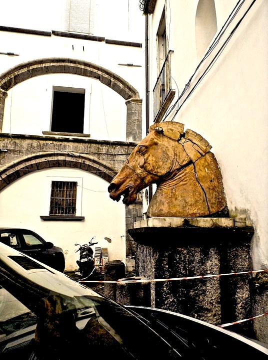
All things material must pass or be set aside – not unlike this head of a grand old equestrian statue mouldering in a seedy car park. The construction of our online lives in software — ‘pure thought stuff’ — is even more ephemeral
– photograph by MIL22

The original version of our masthead, using fonts offered by Wordpress.com through an arrangement with Typekit.com – then arbitrarily ‘retired’ by the blogging platform
Post-Gutenberg has been looking for a new home on the internet after an unwelcome lesson about the flimsiness of all commitments between suppliers of internet services – such as blog-hosting platforms like WordPress.com – and their too-trusting users. Any faithful reader of this blog since its first entry three years ago knows that the one element that stayed constant through experiments with layout and colours was the lettering in its masthead, a style referred to over the centuries as Fraktur, Blackletter, Gothic and – most recently — Brokenscript.
Choosing it for this site was a very small visual joke, a reminder that one of the oldest versions of the typeface was actually carved by Johannes Gutenberg himself in the 1450s, to print his mechanically lettered version of the Bible which – in the Wikipedia’s salute to it,
… was the first major book printed in the West using movable type. It marked the start of the ‘Gutenberg revolution’ and the age of the printed book in the West.
A blog becomes a sort of home on the net for its minders and contributors, over time. Watching the pixels of its masthead swim into view can be as consoling as knowing that there will soon be a mug of fragrant hot cocoa on the other side of your front door on a soggy night on which you approach it with freezing rain snaking down the back of your neck. But suddenly, last summer, that comfort was lost. Post-Gutenberg appeared at the top of each page in the timid, undersized, spidery default font for this layout (or ‘theme’). After a temporary switch to another layout to compensate for the mysterious reversion to what we never chose, it proved impossible to restore the original look of this site – not just the masthead, but the sizes of other fonts we selected with care.
As the use of these custom typefaces is not free, but requires a subscription, the usual excuse for having some part of one’s cyber life turned upside-down — ‘You get what you pay for’ – is hollow. We say this sadly, as WordPress.com – literally wonderful, in innumerable ways — has been a cross between kindergarten and training wheels in our education in unmediated publishing.
One group of WordPress users in England, at thelondonwakecompany, reacted as disgustedly as we did to the blog host’s refusal to offer any explanation for the change:
Hi, our website seems to have lost the original font we used and we can’t seem to get it back, its not in the list of fonts we can use either and it’s changed the whole look, […]There is no other font that even comes close and I’m supremely annoyed. All our marketing material matches our website especially the font and looks completely out of sync now, as there isn’t even a similar font that we can get away with. Why were we not warned of the changes that were being planned? Such a small change for you guys is a headache for us. I would like something to be done, as when I bought our site/signed up with WordPress I was not aware that they can change what they want when they want without any notification or consideration.
It was while fuming over this saga that we came across a record of a surpassing life, the obituary in The New York Times of one of England’s finest exports to the U.S.. Here was a man who somehow helped to found and run America’s only reliably intelligent and advertisement-free TV and radio channel — the Public Broadcasting Service – and personally ran its first suicide-prevention hotline, while living at a vast remove from the public eye and any popular acclaim. He was also an ex-Anglican clergyman and gay rights activist. Not until Bernard Mayes died on 23 October at eighty-five were his achievements ever celebrated in the media – an impression that the Wikipedia’s lack of any media citations before then seems to confirm.
This was the most captivating section of the NYT’s account of his passage for someone maddened by insubstantial software’s ephemerality – a reminder that even what we perceive as reliable matter is, in its essence, far from solid:
As he grew older, Mr. Mayes abandoned his Christian faith and promoted a philosophy that he said was rooted in “scientific materialism.” He called it Soupism.
“There are no gods, no magic, no final judgment and no grand plan,” he wrote on his website devoted to Soupism. “Everything from planets to humans is composed of tiny particles, energy, and nothing else. All the particles are always moving and endlessly interacting with each other as in a soup.”
He discussed the philosophy in his autobiography as well, finding a kind of transcendence in the material world.
“We are,” he wrote, “already close to, surrounded by, enveloped, as it were, in immortality: sheets formed from the cotton of the fields or the wool of the sheep; plastics boiled from minerals dug from the earth or the oil of ancient vegetation; concrete and metal poured from the rocks of the planet; all moving within the endless interchange from which our bodies are derived and from which others are already being born. Never does the process cease; never does it fail us.”

– photograph by MIL22
